Saturday, 23 March 2013

Creative Futures - Glyndwr University (2013)

The Creative Futures week is an annual event held at Glyndwr University with the premise of guest speakers visiting from all aread of the design industry and giving informative talks and holding workshops for students in order to give them inspiration and/or guidance and information on how to achieve certain goals or career paths. Taking place over 4 consecutive days, Creative Futures featured a range of sessions available to be attended by all students who were interested in the specialism of the particular guest speaker(s).

I attended multiple lectures over the week and found most of them beneficial and eye-opening in terms of the information given out to us advising us how to work and found the feedback from guest speakers to questions very helpful.

The first morning we were introduced to a speaker from Salford University who spoke to us about his previous work (of which collaborations with "poverty" stricken areas and installations in said communities stood out) who spoke to us about creating work and and also earning money from our work. He gave use plenty of facts, figures and charts to see how factors like tax affects designers and their income and spending when it comes to work.

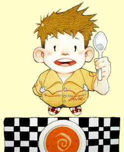
One of the books published by Octopus.
That afternoon I attended a lecture by Yasia Williams-Leedham who is Deputy Art Director of Octopus Publishing in London. A graduate of Glyndwr University (formerly NEWI), she spoke to us about her specialism of book jacket design and showed us examples of designs created by her publishing companies from simplistic story books, punk-themed books and cookery books as well as showing us various clients of theirs such as Levi Roots (who found fame from BBC's Dragon's Den with his Reggae Reggae cooking) amongst others. Yasia also explained that some of the work they publish is from students at Glyndwr who's work is spotted at end of year exhibitions.

The third session I attended was more of a life-guidance and personality-based talk, almost bordering on psychology-type themes. The speaker gave us various activities in pairs and groups to complete, including writing a sentence/quote which described ourselves, three words to describe ourselves as well as an activity based on having each of us imagining an elephant and seeing how different everyone's thinking process was (some people had just a regular grey elephant whilst others had a pink elephant, for example).

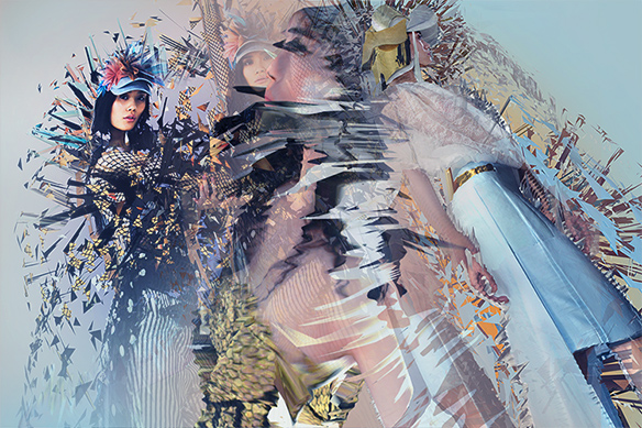
One of Kirsteen Harris-Jones' illustrated covers
A very interesting and appealing lecture I attended was by another former design student at my university, Kirsteen Harris-Jones who specialises in the field of Children's Illustrative books. Signed up with the "Bright" design agency (which she explained was a very helpful thing to do), she took us through her work and the stages it takes from the first developmental ideas of working to the end result. Kirsteen explained how at times, feedback from employers and companies can be quite cutting and can knock you for six so it is necessary to develop quite a hard-skin as soon as possible and to not take criticism personally.

We also had a talk from a gentleman who works at the BBC in London who gave us information on how to handle ourselves in corporate environments should we end up working for a large company. He gave us tips on how to prepare for interviews, the best ways to talk about our work and what employers (especially from large companies like him) look for in a designer.

Also, I attended a session which was titles "How NOT to be a Designer" which featured information on how to construct portfolios in a manner that is 'different' and not something which the employers are used to. Also, he advised us how to make our CVs and applications stand out and other general rules of getting your name and work noticed by employers.

Overall I found Creative Futures very interesting indeed and am looking forward to seeing what speakers will be coming next year to advise us ways to improve and showcase their talents.

Image Source 1

London February 2013: 4 Designers conference

As a field trip arranged by my university, I was able to travel down to London for a couple of days to visit the 4 Designers conference in London along with the other students on my Design: Communication course.

An example of one of the presentations which tried to
help us know what to focus on when working on projects.
Held at the Odeon Theatre in Leicester Square, 4 Designers is an annual event which attracts hundreds of budding artists and designers from all around the world and allows us to witness first hand the experiences and ways of working from four different designers/design collectives.

This year the guest speaker over the two days were Jim Sutherland and Gareth Howart (Hat-Trick Design), Neil Smith (Howdy), Jen Mcaleer (Start JudgeGill) and finally, representing "Dare" were Kerry Roper and Ron Siemerink.

Of all of the designers, the two who stood out the most to me were Neil Smith and Kerry Roper. Smith, representing Howdy, a group of London-based designers, gave us a guide through his entire working life from where he studied to the people he worked for as well as previous collaborations and personal interests that inspire his work and lifestyle. He ended with a quite comedic film in which he himself had took a picture of every meal he had eaten over the course of a year or two.

An example of work by Dare's
Kerry Roper
Welsh designer Kerry Roper's talk really inspired me. He elaborated on the fact that he came from a really rough and "dead end" place in South Wales and worked his way up to the high-ranks of British design with his non-PC approach to his work and endless use of expletives and 'graphic' graphic imagery. His work really had an effect on me with their almost "anarchist" qualities and range of techniques and I left the conference thinking "I need to look up this guy's work!!".

All in all the 4 Designers conference (as well as the free time in London sightseeing) proved for a very memorable and extremely enjoyable couple of days.

Links to the official sites of the design companies of the speakers at the 4 Designers conference:

Hat-Trick Design
Howdy
Start Judgegill
Dare

Image Source

Alan Fletcher

The late, great Alan Fletcher is perhaps well-remembered as one of Britain's most recognised designers, especially thanks to his creations of now world-famous logos.

Fletcher's instantly recognisable logo for the Victoria & Albert
Museum, London. 
Having quite a childhood where he was moved around the world (from Kenya where he was born to England and then moved around there) Fletcher finally found his feet in 1949 when he began his art studies which eventually lead him on to study at the Central School of Art and the Royal College of Art where he studied alongside and befriended many now well-known designers including Ken Garland, Peter Blake and Len Deighton. In the 1950's Fletcher also accepted a scholarship to study at Yale University under prolific designers such like Paul Rand and Josef Albers at their School of Architecture and Design.

After his what seems like many years of studying and tutoring, Alan went on to design for brands including Pirelli, Cunard and Penguin Books with "Crosby/Fletcher/Forbes" alongside his collaborative partners Colin Forbes and Theo Forbes (who later went on to, along with the introduction of a few more designers, establish themselves as "Pentagram", a collective who I have discussed in a previous blog entry).

As well as his design work and having his work exhibited globally, Fletcher is also a well-established author who released multiple books under the theme of design.

Fletcher's work will remain as some of Britain's best in the design field, in my opinion.  His V&A logo for the London Museum is instantly recognisable and still as heavily used now in the field of British Art & Design as it was back when it was first designed and used over 20 years ago. A huge inspiration to me, Fletcher's simplistic yet bold style of working really has an effect on some of my work and I'm sure will do for other artists/designers for many, many years to come.

Image Source

Scott McCloud

Cartoonist Scott McCLoud first came to my attention when I purchased his brilliant book "Understanding Comics: The Invisible Art" prior to starting my time at university. The very, very highly-illustrated book is set out itself as one big comic book,with all text written in speech/think bubbles or boxes, all in very precise points. A great read that helped me immensely in getting to grips with the way that comic books work properly and effectively but also it introduced me to a whole new form of "art" as comic book-style work had never been very prominent in my previous findings. The book opened my eyes for sure!

A good example of the way "Understanding Comics" is
set out (from start to end).
McCloud, hailing from Boston, Massachusetts, decided from an early age the career path that he wished to go down and found himself soon enough graduating from Syracuse University with a Bachelor in Fine Arts. From here he went on to establish himself as a professional designer with the creations of pieces such as "Zot!" (1984) and "Destroy!!" as well as being employed as a writer for the already well-established DC Comics name.

McCloud begins his work using basic pencil sketched and then completes/adds to them using digital software such as Illustrator for the typographic elements and Photoshop for the imagery.

Although publishing brilliant and widely-recognised work, Scott is nowadays perhaps most known for his work elaborating on the 'theory' of comic books with his published books, one being the aforementioned "Understanding Comics" (1994) but also his follow-on to this, "Reinventing Comics" (2000), which also took the extensive comic book layout as it's predecessor.

I'm very inspired by McCloud's work with it being, as I said previously, a big eye opener to the world of comic books and a really helpful and effective way of introducing me into a field of work which I had previously never really had an interest in.

Image Source

Thursday, 21 March 2013

Sara Fanelli

Italian-born Sara Fanelli mainly focuses on a collage-style of working when it comes to her illustrations. A former student at the Royal College of Art in London and a previous recipient of the Macmillan Prize for a Children's Book (amongst other prestigious awards), Fanelli's clients include The New York Times, Ford, BBC and many more highly successful and world-renowned companies.

One of Fanelli's instantly recognisable compositions.
Fanelli's collages are all created by hand rather than digitally purely through choice, she feels more connected to her designs and artwork when she's manually designing as oppose to using a tablet or design software. Sara also believes that experimentation is key when it comes to design, She explains:
"I like to experiment. When I make a collage illustration I start with a drawing of the composition, the layout. Then I play around with it, interweaving it with all the different items I might be using. I like to play around with the typography too and create my own lettering. I don't use a computer to create artwork. Too many designers rely on them".
 Fanelli's work contrasts shape, colour and also type and makes for diverse and highly interesting compositions of very different subject manner, from human figures to animals and many more well thought out and complex designs.

Image Source
Quote Source

Ross Collins

Glaswegian children's illustrator Ross Collins is one of my favourite and I think most referenced designers. Recipient of an abundance of awards including a Macmillan Prize (1994), Scottish Children's Book Award (2011) and an Oppenheim Award (American design awards), Collins is no stranger to success.

One of Collins' charming illustrations.
Having over one hundred illustrated publications to his name, Ross has exhibited his work on a global scale at major cities like New York and London as well as being a regular at international book festivals where he continually showcases, exhibits and sells his work as well as also being a favourite at primary schools where he hosts talks and workshops with eager children (his target audience!)

Having built up an extensive portfolio, there's no wonder that his range of established and renowned clients include Disney and Pixar for whom he does Animation Character Development.

I really like the fact that Collins really concentrates on his target audience and works with them in workshops in order to perhaps get a better understanding of the types of stories that they want to read and develop the characters under their instruction to improve his work in the long run.

Image Source

Chris Ware

Chris Ware is a notable American comic book artist who is perhaps well know for his affiliation with the ACME Novelty Library cartoon company as well as his own series of graphic novels. Interestingly, Ware is not your typical cartoonist in the sense that his subject matter is quite dark and covers matters including mental health and negative elements within today's society.

An example of Ware's precise work, which
graced the cover of The New Yorker.
Resembling work that would have been popular and 'current' at the start of the 20th Century, Ware's designs comprise of meticulous detail (for both typography and general illustration) and influential components from the 'Rag Time era' such as classic cut out toy designs, music sheet designs and classic newspaper cartoonist-style illustrations.

All of Ware's precise and immaculately drafted work is done by hand with ink, although sometimes appearing to be at first glance digitally created. Using a range of geometric tools such as T-squares and rulers, Chris only uses digital elements into his work for the purpose of adding colour, nothing else whatsoever.

I'm a huge fan of Chris Ware's work, finding his attention to detail and meticulousness absolutely out of this world. The way in which he crafts an image or design is an art form in itself, with an unimaginable amount of time consuming geometric-based formatting involved. I myself can never see myself working in such a close-knit way due to being quite an "urgent" person, however I have total respect for artists and designers, like Ware, who do.


Lars Von Trier

Lars Von Trier is one of the world's leading directors who has been known to over the years divide opinions of critics and the public audience alike.

Von Trier takes his work extremely seriously and even has a set list of rules to abide by when it comes down to his craft. As part of the Dogme 95, which was a movement of avant-garde film-making founded by Lars and fellow film-maker Thomas Vinterberg in 1995 that prided itself on being able to create accessible films that were of great quality without the need to of a huge budget or "Hollywood" sets, Lars prided himself on this and kept within the strict rules and regulations of the "Dogme 95 Manifesto", which consisted of the following ten conditions...
These rules, referred to as the "Vow of Chastity," are as follows:
  1. Filming must be done on location. Props and sets must not be brought in. If a particular prop is necessary for the story, a location must be chosen where this prop is to be found.
  2. The sound must never be produced apart from the images or vice versa. Music must not be used unless it occurs within the scene being filmed, i.e., diegetic.
  3. The camera must be a hand-held camera. Any movement or immobility attainable in the hand is permitted. The film must not take place where the camera is standing; filming must take place where the action takes place.
  4. The film must be in colour. Special lighting is not acceptable (if there is too little light for exposure the scene must be cut or a single lamp be attached to the camera).
  5. Optical work and filters are forbidden.
  6. The film must not contain superficial action (murders, weapons, etc. must not occur.)
  7. Temporal and geographical alienation are forbidden (that is to say that the film takes place here and now).
  8. Genre movies are not acceptable.
  9. The film format must be Academy 35 mm.
  10. The director must not be credited.
Cover of "Antichrist" (2009)
Since the collaboration ended, Von Trier has gone on to create multiple multi-award winning films including "Dancer in the Dark (2000), "Dogville" (2003) and the erotic horror "Antichrist" (2009).

Out of Von Trier's films I am ashamed to say I have seen just one, "Antichrist" starring Willem Dafoe and Charlotte Gainsbourg, which is a brilliant film and I consider it to be one of my most recent favourites. An extremely dark and disturbing supernatural tale which is full of clever camera work, intense and brutal narrative and all in all the makings of a definite future classic of the horror movie genre.

I believe that Lars Von Trier is an extremely talented filmmaker and although he doesn't closely relate to my specialist field, I feel motivated to watch other films he has made thanks to my research.

Image Source

April Greiman

Designer April Greiman, head of Made in Space (Los Angeles based design consultancy) is acclaimed for being a part of a collaboration who were given the honour of being named the "establishers" of the New Wave style of design that swept America during the 1970's and 1980's.

For over the last 30 years Gremain has proved to be an inspirational force in her specialist field of transmedia projects and film installation. Considered an artistic explorer, known to delve deep into themes of colour, text and imagery, April has found a good balance in incorporating the two seperate mediums of art and technology (including beautiful technology) into one.

"Hand Holding Bowl of Rice" - Koreatown, Los Angeles

An element that has played a big part of her career is public art installations, perhaps one of the most prominent being "Sears Great Indoors", a 60 feet long geometric concrete design with embedded accents of stainless steel. Also, "Hand Holding Bowl of Rice", an 82000 square feet design covering two walls which features an oil painted translation of a video still of literally a hand holding a bowl of rice. This piece was inspired by the tale of an Indian Goddess' gesture of rice as a sign of abundance as well as Gremain's own fascination with the fact that a single grain of rice has one of the most complex DNA's of any species.

Image Source

Pete Fowler

Welshman Pete "The Monsterist" Fowler is what I would refer to as a very "unique" character. A designer with his finger in many pies, Pete not only illustrates but is also a musician and even has his own range of children's toy characters (under the brand "Monsterism") which began circulating over ten years ago. His work is described as...

"...a world where character design meets music and art in a weird and wonderful way.
That world is Monsterism, a place where banjos are played by horned owls and synths tweaked by mutant horses. His unique, instantly recognizable approach and sense of playfulness and visual adventures have brought his work to the attention of people around the world."

In terms of his illustration work, Fowler creates quite simple but extremely colourful, bright and charming pieces using various techniques such as painting, sculpture and printing and has had this work exhibited all around the world many times.

Fowler is perhaps most known in his (and my) home country of Wales for his designs affiliated with the band Super Furry Animals, for whom he created album/single artwork, publications and merchandise for the musical group.

One of Fowler's many characters, full of
personality!

I love Pete's work! The bright colours, the vibrancy and the crisp appearance makes his illustrations really stand out to me. As well as his mind-blowing almost abstract pieces, I really like the way he depicts his characters and this has really inspired me to perhaps try simpler ways of designing my own when the time comes. "Less is more" comes to mind with how he manages to simply but effectively get across a "persona" of his characters. Just brilliant!

Image Source

Jonathan Barnbrook

Again, heavily influenced by digital design and technology, Jonathan Barnbrook has made a name for himself around the world especially in Japan (where he is one of our most well-known designers) a country which Barnbrook has completed many designs for corporate identities.

A major factor and inspiration in Barnbrook's work is political issues and social factors. Barnbrook responds to these through his artwork, using it as a creative medium to get is thoughts and feelings across to his audience.

David Bowie - Heathen (2002).
A notable piece of work created by Barnbrook is the album cover for musician David Bowie's iconic album "Heathen". Barnbrook describes his creation as a descriptive play on the word "heathen", in which he famously turned the word upside down to emphasise the meaning (i.e. upside down cross symbols signifying the anti-religious and sometimes Satanic).

As a general rule, Barnbrook's work wouldn't usually interest me although I do like his use of "current affairs" in his work and also his fearlessness within his work (e.g. Bowie's album art could have and most probably would have terribly offended religious people).

Image Source

Wednesday, 20 March 2013

Yugo Nakamura

Yugo Nakamura is considered one of the world's greatest and most innovative web designers who has received acclaim for his unique and groundbreaking complex interface creations.

Back in 1999 Nakamura caused sensation when he unveiled an update to his MONOcrafts website (a site filled with over a decades worth of experimentation with web inteface and layouts which in their own right were deemed as "revolutionary") as it was the landmark event that kick started the use of the then newly-released Flash 4 computer software. The reveal saw his audience greeted with a totally new web experience with the aspect of the ability to create your own fluid interfaces.

An example of Nakamura's heavily digital
work.
Nakamura considers John Maeda to be a massive influence of his (who I have dedicated a previous blog post to) and it is easy to see some comparisons in their working style as both enjoy abstract and overtly creative digital aspect of design.

As much as I enjoy viewing work by designers like Nakamura and Maeda and appreciate their concepts and general design processes, I just could not see myself ever working in this way. I prefer images that rely on simplicity to get a message across rather than using a heavy influence on technology and manipulation.

Image Source

Susan Kare

Susan Kare is considered one of the innovators of computer design due to her creation of many of the digital interfaces during the 1980's for the Apple Macintosh and kept a close working relationship with Apple CEO Steve Jobs for many years to come.

Ph.D. Art graduate Kare, a native New Yorker, got a job with Apple through a friend from high school who worked for the company and recommended her to his colleagues. This is where Kare would really start to shine by designing typefaces, interfaces and her now trademark "cute" icons and logos with which she found a way to be very simplistic whilst still managing to keep said icons memorable.


A selection of Kare's classic Apple Macintosh logos.


Karen has since gone on to design for more well known companies including Facebook and has still kept her close ties with Apple by designing for their latest iPhones (the app "Karma Jar").

As her official biography states on her official site:

...good icons should be like road signs than illustrations, easily comprehensible, and not cluttered with extraneous detail. 

I adore Kare's icons and general style of work. The way she allows so much simplicity in her work is very brave and shows that she is a confident designer who has found her own signature and "what works well for her".

Image Sources: 1 2

Daniel Brown

Designer and programmer Daniel Brown has made a name for himself as a successful artist, working within the fields of Digital and Interactive Art (also Applied Arts and Design). Brown's technique is combining his previous extensive knowledge of computer programming and user experience design for items such as interactive phones/tablets (i.e. iPads/iPhones) as well as Flash players, Java Scripts etc with traditional design techniques to find a perfect balance and produce the creative work he does.

For well over a decade Daniel has been acclaimed by critics and has often found himself listed in 'Top 10' lists for categories such as internet designers and has had his work exhibited globally in New York, Tokyo and Milan for the British Council's "Great Brits" show.

Researching Brown's work I found his floral pieces particularly interesting as well as his pieces which combined photography of already complex objects (such as fashion photography with dresses made out of 3D triangles of fabric cuts, for example) and then had them manipulated digitally to create an even more extensive effect/illusion.

An example of the manipulation of complex photography, almost making a pattern through digital warping.


Another element I found interesting was how his digital manipulations are not always totally obvious so the audience must "work" to get the full experience of the piece and not just have a quick glance. His work needs to be "studied" rather than just "observed".

Hi-Res

Founded back in 1999 by German designers Alexandra Jugovic and Florian Schmitt in London, Hi-Res combine the seperate mediums of music, graphic design, product design, film and fine art into one monstrous design juggernaut, creating edgy, post-modern pieces.
A campaign by Hi-Res for sports brand Adidas

Since their arrival, Hi-Res have reached critical acclaim and won numerous awards including the D&AD Silver Award and BAFTAs and have cemented good professional relationships with clients such as fashion houses Dolce & Gabana and Chanel as well as alcohol producers Jagermeister, broadcasters Channel 4 and 20th Century Fox amongst a lot of others.

Even though they have reached such success, Hi-Res are still adament to stay close-knit and remain a somewhat "small" establishment whilst having bases in major cities around the world including London and New York City.

Hi-Res are very appealing to me. Their edgy and current design allow them to broadcast their talents through their almost endless list of highly notable clients.

Image Source

John Lawrence

John Lawrence is, in my eyes, a brilliant illustrator who ticks all of the boxes in terms of what I would look for when looking for inspiration. His prints (my favourites being the woodcut prints) are brightly coloured and  very eye catching, giving the children who read his books brilliant additions to their inspiration.

"This Little Chick" book cover
Originally from Hastings, John also works as a teacher whilst still deciding to still pursue his main passion in life as a freelance illustrator and went on to illustrate in excess of 200 books.

Covering both general and children's illustration, John Lawrence's briefs have ranged from illustrating Shakespearean tales to the classic "Watership Down", quite a diverse portfolio.

It is clear to me how this man has made such a name for himself and even had one of his creations named New York Times Best Illustrated Children's Book of the Year. One of my favourite children's illustrators whose creations really make me smile.

Neville Brody

Once a student at the London College of Printing, British designer and art director Neville Brody is well known for his work in publications especially in the entertainment industry and primarily within music. Not only has he worked for high-profile magazines such as "Arena" and "The Face", Brody has also designed album covers for very successful musicians and bands, notable the legendary Depeche Mode.
One of Brody's eye-catching  typographical pieces
featuring Radiohead frontman Thom Yorke.

Aside from publication designs, Neville Brody is also well respected for his own work and has been known to attract considerable amounts of fans to his exhibition shows, most notably in 1988 where his work displayed at the Victoria & Albert Museum, London attracted over 40,000 viewers before embarking on an international tour off the back of this positive public reaction.

Another area of which Brody is established is typography as a founding member of the London organisation FontWorks before then going on to collaborate with legendary typographer Erik Spiekermann to create the FontFont library.

From looking at a range of Neville Brody's work it is clear that he is a designer who likes to push boundaries and I adore his use of bright colours and creation of shape and form through the use of type.

Why Not Associates

The British design company Why Not Associates, much like Pentagram and Tomato, are diverse in the fields they cover and even create for government purposes. Working in corporate identity, motion graphics, television (commercials), editorials, environmental design and publishing amongst others has enabled them to design for customers including Nike, Virgin Records, Audi, The Turner Prize and The BBC.

They also pride themselves on their work in smaller communities for less notable "names" in the industry and creating installations and other smaller projects and believe that communication is the key to great design and allows for the element of surprise to live on through creativity.

WATCH: BBC Charles Dickens Season promo created by Why Not Associates.

Video shared from Vimeo.

Like the other design collectives mentioned in this blog, I find Why Not's work appealing due to the diversity of their clientele and the work they are able to produce thanks to having a wide range of specialist-based employees working for them.

Tomato

Another multi-disciplinary artistic collective that are very prevalent are Tomato, who interestingly not only employ designers and craftspeople but also musicians and writers, making them very, very diverse.

Founded in 1991 by eight up and coming creative minds (who some went on to form the legendary electronic music group "Underworld"), Tomato have gone from strength to strength and are nowadays considered to be one of the top creative agencies in the United Kingdom, working (which ranges in design, architecture, performance, public speaking etc) with clients such as globally popular sports brands Reebok, Adidas and denim manufacturer Levi's.

Their first project titled "Ipso Facto Yeah Yeah" was released in their founding year, is a sort-of music video which incorporates the production of film, sound as well as design (the film depicts graffiti street art on the London Underground juxtaposed with the hustle and bustle of city life). The video can be viewed below (courtesy of YouTube):


Even as a huge fan of Underworld and the prominent dance/electronic era of the 80's and 90's, I still didn't know that they were associated to heavily with Tomato and am glad of what my research has helped me discover. An interest of mine is performance and video art which is something that Tomato do very well and has garnered interest in me to delve further into the organisation.

Pentagram

Based in five major cities around the globe and sporting the largest creative multi-disciplinary design consultancy, Pentagram are leaders in collective deign. From installations to websites to architecture to books, Pentagram cover a wide area in the design field with each member of the team having expertise in their own "area" of design.

The revamped "visual identity" of the Saks Fifth
Avenue department store.
Founded in London in 1972 by a small group of five designers (including the brilliant Alan Fletcher), Pentagram has gone from strength to strength and has built up a reputation of professionalism and great production which has landed them high-profile jobs for clientele including Tesco, Boots, Tiffany & Co. and Nike.

Again touching upon their wide field of expertise and clientele, Pentagram have been employed for some very high-profile design jobs, recently being given the opportunity to re-design the entire visual identity of Saks Fifth Avenue, an upscale American department store chain which houses some of the most luxurious shopping brands in the world.

I find Pentagram very appealing. Their work covers such a diverse range of areas that they are a great source of reference and research for most areas of my course and indeed future career path.

Image Source

Saturday, 16 March 2013

Spike Jonze

American director Spike Jonze works primarily in the fields of film, television, commercials and music videos. His name is recognisable to me from his huge success as director of the brilliant film "Being John Malkovich" (1999) for which he received an Academy Award but also as the director of a movie much more recently, "Where The Wild Things Are" in 2009 which brought to life the classic children's illustrated book by Maurice Sendak.

A still from the brilliant "Where The Wild Things Are" (2009) directed
by Spike Jonze

Outside of film, Jonze has also directed music videos for Kanye West, The Beastie Boys, Fatboy Slim, Notorious B.I.G. and R.E.M. amongst many, many others. All highly successful musicians/bands and highly successful songs directed by Spike.

There is also a link here with a subject of a previous blog post - Michel Gondry, as the two, along with Chris Cunningam, co-founded Directors Label, an organisation who honour music video directors.

I really appreciate the diversity in subject matter of Spike Jonze's work and am a huge fan of some of his work (predominantly music videos and films) and am intrigued to see what else I can witness of his in the near future.

Image Source

The Chase

The Chase are a design collective based in Manchester, Preston and London who describe themselves as:
"We describe ourselves as creative consultants. Not designers, or writers, or advertisers, or brand strategists but all of these and more. In the last year we have been both playwriters and drinks mixers. Yes, there is the usual list opposite but who knows what may be the best solution for you."
"Freedom"
Clients of The Chase range all over the world but include well know British establishments and organisations such as BBC, B&Q, Royal Mail, NHS, National Trust and also Disney. The Chase currently have 29 people in their design team ranging from both illustration and graphic design.

Due to the wide range of skill and field of expertise within the group, their work as a whole is quite diverse from simple graphic/digital iconography to photography and typography and even product design.

From an illustrative point of view this work is hit and miss with me. Although I do like most of the work, it seems that it is predominantly digital based and quite 'simple' which is fair enough, but for me I would like to see perhaps some more evidence of "traditional" media.

Quote Source

Vaughan Oliver

Vaughan Oliver is a British graphic designer from Surrey who is perhaps most known for his affiliations with both the design studios "v23" and "23 Envelope" as well as with record label 4AD who employed them in order for them to create distinct design identities for their signed musicians who ranged from The Breeders to Pixies, somewhat large names in the 1980s music scene.
Cover of Pixies' album "Doolittle", created by Oliver

Oliver is celebrated not just for his design innovation but also his collaborative projects, working with other designers such as Marc Atkins, Simon Larbalestier etc, and his brilliant imagination when it comes to projects. To many, Vaughan is credited as "setting the stage" for a graphic revolution which came about in the 1980's and 1990's and is often considered a master in the design and music industry post-punk era.

From viewing Vaughan's work it is apparent he is a very diverse designer who enjoys "pushing the envelope" so to speak. I find both his creativity and great imagination extremely appealing

Ian Pollock

"Tales of Terror" stamps (2007)
Ian Pollock is an award-winning British cartoonist and freelance illustrator and former student of the Royal College of Art (MA).

His first publication was "The Miracles of Christ" (1976) which started a lengthy career in design. He has illustrated advertisements and posters for organisations such as the Royal Shakespeare Company as well as having his work featured in renowned literary names such as Rolling Stone, Playboy, Elle, New Yorker, Esquire and Radio Times.

An interesting element to Pollock's career is his design of themed postage stamps. He has designed stamps on two separate occasions, once in 1990 where he created a commemorative Thomas Hardy stamp, a Tess of the D'Urbervilles stamp and a Mayor of Casterbridge stamp - which all were sadly dismissed by Her Majesty The Queen as "unsuitable" and later not published.

However seven years later Pollock was commissioned to design horror themed stamps in a series entitles "Tales of Terror" which showcased Mary Shelley's horror classic "Frankenstien" and also Bram Stoker's "Dracula" among others, which became extremely popular.

I'm drawn to Pollock's quick and confident style of drawing and his bold use of tone and shadow as well as his sparse use of line, I find his work very inspirational.

Jonny Hannah

"Mermaid Cafe Carbolic Milkshakes" (2009
Scottish Illustrator Jonny Hannah, a graduate of The Royal College of Art, works both in general illustration (paper/digital based) and in video and film fields. Jonny has won a BAFTA for his work where he collaborated with Johnathan Hodgson in 2000 for a small yet obviously effective film entitles "The Man With The Beautiful Eyes" for British television channel Channel 4. The five-minute long film incorporates the use of a poem with the dark subject of a child's negative perception on adult life and how parents restricted children from certain areas of life.

From advertisements to other mediums, Hannah's harsh screen printing style of work and also somewhat "old school" subject matter (his work garners almost a sense of 1950's design and culture) are instantly recognisable. His work also reminds me of Americana due to his mid 1900's influence (it appears) and interest, which I find very appealing and aesthetically pleasing.

Image Source

Designers Republic

Various examples of work created by The Designers
Republic
The Designers Republic (often abbreviated to TBR) was a Sheffield-based Graphic Design studio which created pieces for various platforms in media and advertisement such as CD and DVD covers, music videos, web design and packaging. The group were universally renowned and recognised for their use of post-modernistic irony as well as minimalistic tendencies and uniformed style.

Founded as a flyer-designing company by designer Ian Anderson, the 'faction' later moved on to designing musical related pieces which would feature on album and single covers and go on to give them the exposure they desperately needed. Their work could be seen gracing the covers of releases from bands like Aphex Twin, Supergrass, Moloko and Pulp.

Aside from this area of design, TDR also worked in video gaming, creating the packaging and visuals for the 1995 Sega Saturn game "Wipeout" as well as the packaging and advertising campaign for the first of the "Grand Theft Auto" series (1997).

I really like how even though each piece is drastically different, you are still able to notice that it's possibly a piece created by TDR due to the minimalism and other defining factors that almost give their work a visual identity and connection.

Image Source

David Hughes

One of Hughes' many published illustrations,
this one depicting author William Shakespeare.
David Hughes is, I think, a brilliant yet somewhat unusual, perhaps "eccentric" illustrator. His work is somewhat "frightening" at times with his use of quite dark imagery (skulls, obscene nudity etc) but nevertheless always eye-catching and extremely interesting.

Stockport's own Hughes, who during his lengthy and successful career has worked both freelance and for major organisations (like Granada for example) received acclaim for his work for "Othello" which resulted in winning the D&AD Silver Award in 1999, has had his work exhibited at the Royal College of Art and has also won a Pentagram Award.

I just love Hughes' work. Although, as I said, at times it can be quite dark and "adult", I admire the way he uses rough tone in his pieces and am really drawn to the way he draws/describes his characters. For example, taking into account the Shakespeare piece in this post, it clearly is William Shakespeare yet it has not been drawn extremely well. David captures his subjects without the need for realism and time consuming attention to detail.

Image Source

Michel Gondry

Renowned for his inventive and manipulative visual style, French film maker Michel Gondry first came to my attention with his brilliantly eye-catching music videos for Icelandic musician Bjork as well as other bands such as Daft Punk and The Chemical Brothers. He later went on to work for the award-winning and critically acclaimed movie "Eternal Sunshine of the Spotless Mind".

One music video that I did not know was created by Gondry until this research turns out to be one of my all-time favourites. The White Stripes insane music video for "Fell In Love With a Girl" consists of an almost two minute long LEGO animation of the duo in different situations with each segment rebuilding the bricks frame by frame giving the illusion of continuity. Here is the video below:


I love how abstract this video is and although it doesn't correlate with the actual song, it still catches your attention and grabs you, draws you in. I think this was the intention as with it being such a short song something was needed to draw people's interest. I can definitely call myself a fan of Michel Gondry's work and appreciate how powerful film work can be.

Video Source


Kyle Cooper

Being a graduate of the acclaimed Yale University and studying under a master of graphic design like Paul Rand, it would seem  that there would be a lot of expectation and "hype" to live up to. Kyle Cooper has definitely lived up to this.

Working in the field of motion picture title sequences, Cooper first reached critical acclaim whilst working in New York and created the title sequence for the 1995 "Seven" (often stylized as "Se7en"), a gritty crime drama starring Brad Pitt and Morgan Freeman.

Screen-grabs of the title sequence that Kyle Cooper created for "Se7en"
Cooper's use of hard-hitting imagery and loose, almost "scribble-like" font fulfilled his initial intentions of "pushing the bar creatively" and conveyed the main theme of the film, the Seven Deadly Sins.

Although not a fan nor an enthusiast of video-based design, I do appreciate the power that it has and how, like illustration, it can be used in many effective ways to convey an idea to a particular audience. I do feel that  Cooper's work for "Seven" really does set the scene of the film and I do like the gritty and tense atmosphere that this particular title sequence alludes.

Joel Stewart

Joel Stewart is one of my favourite illustrators. A graduate of the Falmouth School of Art & Design, Stewart makes his living as both an illustrator and author (as well as a budding musician).

An example of Stewart's work
Dabbling with both traditional and digital media, Joel combines these and eventually reaches a fine finished stage of mainly digitally enhanced watercolour pieces which are bright and eye-catching. Mainly illustrating children's stories and publications (such as Hans Christian Andersen stories, The Adventures of Abney & Teal, The Silver Sovereign and many more), Stewart worsk both in bright, bold colours as well as using quite dark and tonal media.

I love the crisp appearance of Joel's work and how much they stand out off a page, it's no wonder that this man's work is so highly acclaimed by both his target audience and critics alike.

Image Source

Lauren Child

As the creator, author and illustrator of the children's book series "Charlie & Lola", Lauren Child MBE has been a household name for young children all over the world for well over ten years now.
The first book in the Charlie & Lola series "I Will Never
Not Ever Eat a Tomato" (2000)

The award winning series (which made it into the Top 10 all-time winners of the prestigious Kate Greenaway Medal and the eventually landing third place in a public vote) spawned the start of a successful line of works for Lauren including the brilliant Clarice Bean series, the Ruby Redfort series of books and also most recently a series of books illustrating the adventures of the classic Anne of Green Gables, another highly successful series.

Having young relatives I have come across these books, especially the Charlie & Lola series frequently and have always admired the illustrations inside. I love the use of simple block colours and sparse line which are simple yet effective.

Image Source

J. Otto Seibold

Children's Illustrator J. Otto Seibold quite simple but effectively eye-catching designs have interested me for a while now. I first came across his work a couple of years ago when looking into Alice in Wonderland and found a book illustrated by him. His use of digitally-enhanced, simple and bright setting teamed with cute and expressive characters really inspired me.

An illustration from an Alice in Wonderland publication
illustrated by Seibold.
I really like the way the backgrounds of his pieces (as can be seen in the image here) are quite simple and almost solid colours apart from using lighter/darker shades to accent objects. This, teamed with his detailed and expressive character models are really appealing to me as even though the main focus is the characters, the backdrop still stands out and is interesting whilst still minimal and simple.

A really interesting designer who clearly has a lot of fun with his work which makes it fun to view and use as inspiration from time to time.

Image Source

David Carson

One of Carson's many publications on surfing.
Carson is a keen and well-known surfer himself.
American graphic designer David Carson is considered to be one of the innovative designers using typography (primarily during the 90's during the "grunge typography" movement) and is perhaps best known for his affiliation and work with Ray Gun magazine (where he cemented his unique style).

Producing works for clients from clothing brands Ray Ban and Nike to engineers Mercedes Benz and Toyota, Carson's somewhat unorthodox style and his incorporation of typography into this way of working is immediately recognizable on various advertisements, campaigns and in galleries alike.

Sort of a rebel in the typography field, one of the most notable moments in Carson's career was, whilst working for Ray Gun, using the completely symbolic Dingbats font (which is absolutely non-legible) for the write of an interview with musician Bryan Ferry of Roxy Music fame. His reason behind doing this? Because the interview was "boring".

Image Source

Ronald Searle

Award winning satirical cartoonist Ronal Searle CBE is one of my biggest inspirations. I read some of the books from the "St. Trinians" series as a youngster and was always (like with many other books) more interested in the illustrations than the actual story.

Cover of "The Terror of St Trinian's and Other Drawings" - a
publication  featuring a host of Searle's illustrations.
A diverse designer content-wise, Searle's other work includes his documentation of his years spent as a prisoner of war, with graphic representations of the conditions which he encountered (i.e. fellow soldiers dying from diseases like cholera etc)

Searle's confident, quick and loose style of drawing really opened up my eyes to the fact that illustration was not all about drawing something that looks "exactly" the way it would in reality and that it's okay to push the envelope.

Image Source