Overall I feel very happy with the way this project has been put together although I have had a few issues. In particular I feel that perhaps my predictions of how long each blog post would take in terms of time have been far wrong and almost tripled from my original estimation. Another quite judgmental factor was how I sort of immediately wanted to dismiss the people on my list of research who were not predominantly in my chosen field of illustration as I straight away felt that they would not lend themselves in being a positive influence on my work or way of thinking. However now I know this was a wrong thing to do as it turned out that quite a few of these once dismiss-able people/groups turned out to be some of the more interesting research projects on the whole blog, giving me insight into new ways of working such as techniques including photography and film (areas of which I had practically no knowledge of beforehand).
As a whole I have come out of this project with a positive outlook in terms of reference and information in order to progress my work for future projects as well as my own personal ideas. I now know that I have a catalogue of rich, clear and useful information to delve back into if ever I need to get some inspiration for a difficult brief or perhaps work on a subject area which is not within my specialist field of illustration and use it as a starting block. Also, my knowledge of different ways of working has grown significantly and I now can have a better idea of processes available in order to improve and develop work and transform it into something completely different to what I first imagined it to end up like.
In conclusion I am proud of the blog that I have put together from scratch with the layout design and customization to the chosen imagery and writing that I have produced for each designer(s) on the "Heroes & Heroines" research brief. Although I admit that not every person on the list filled me with inspiration or much interest it was still highly useful for me to delve into areas of design and gain information from these as if not forced to do so, I very much doubt that I would have done in any other circumstance.

Thursday, 9 May 2013
Elaboration 4: eBoy
The fourth and final artist(s) I have decided to delve deeper and look further into is the world-famous digital collection eBoy. A group that have interested me for a long, long time and who, after further research, have made me gain a greater interest in precision, accuracy and extensive detail which are all main factors and elements of their unmistakable cityscape compositions.
In each of their compositions it can easily take at least fifteen minutes or more to really investigate the image and pick out everything that is included in it, including characters, signs, logos, building detail and accessories. Each piece is bulging with colour, interest and precision and are truly, in my opinion, masterpieces. I have trouble with patience at times and could never imaging myself setting myself such a mammoth task as eBoy set themselves.
Their surreal and 'fun' pieces really strike me as being literally something like I've never, ever seen before. I just think their work is fantastic even though it's something that I myself could never, ever do.
Image Source
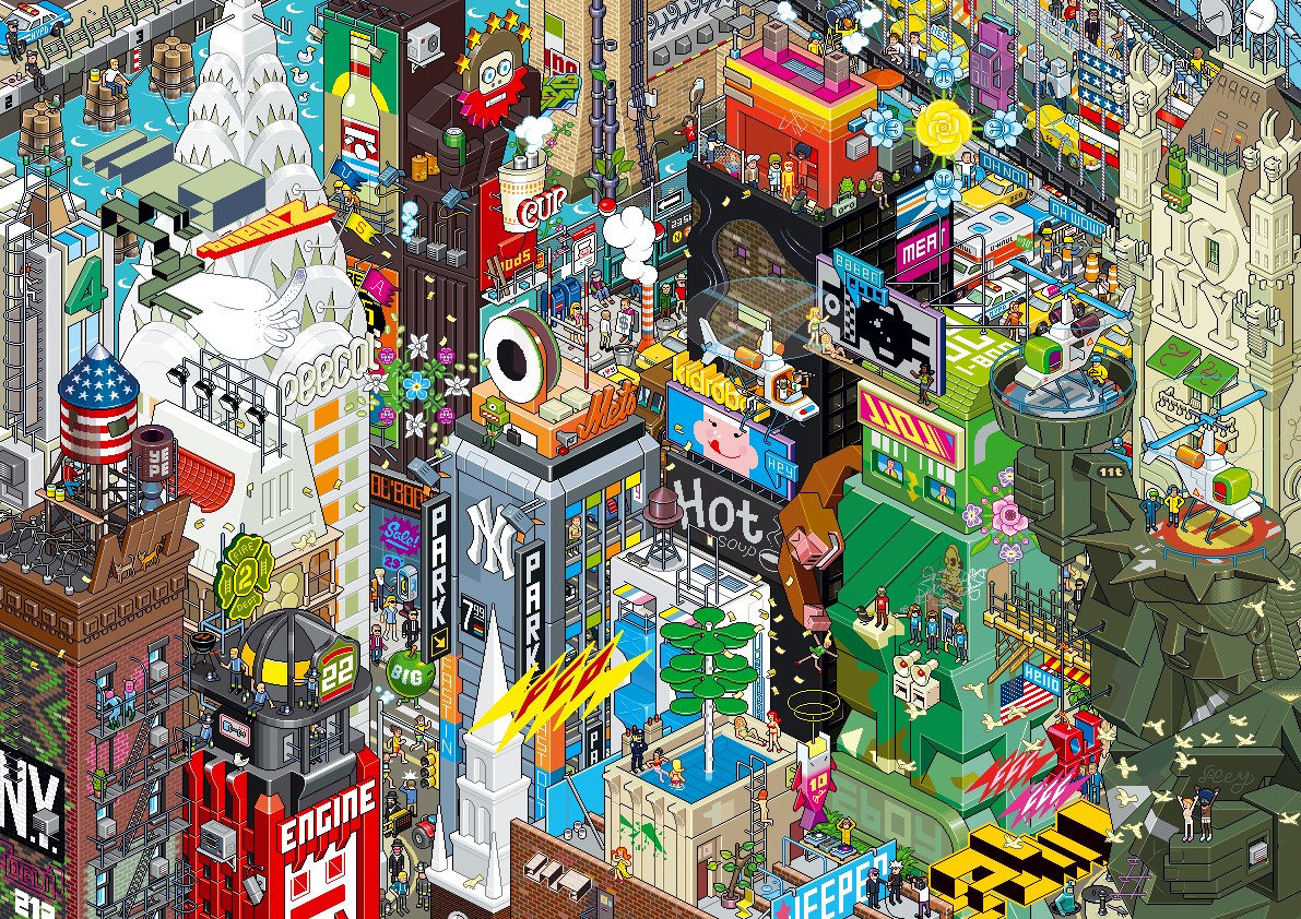 |
| One of eBoy's intricate compositions - so much to see! |
Their surreal and 'fun' pieces really strike me as being literally something like I've never, ever seen before. I just think their work is fantastic even though it's something that I myself could never, ever do.
Image Source
Elaboration 3: Jonny Hannah
Scottish illustrator Jonny Hannah is the third designer I ave decided to highlight for further discussion.
As a fan of bright, colourful and exciting artwork, Jonny Hannah's work attracted me straight away. His bold use of colour and mixed, exaggerated typography and mark making really inspired me and immediately captured my interest. I find his sporadic use of text really interesting (as seen above, there's no set 'design' or layout for where he positions his type faces). I feel almost that he considers his text as extra imagery rather than just 'writing'. Whereas I would consider the image and the type as two seperate elements I think that Jonny Hannah considers both as one entity.
Another aspect of his work which I find quite interesting are his mixed use of backgrounds in his work. As you can see from the image in this post of the late, great blues musician Louis Armstrong there are three areas which compose the background: blue striped, translucent pink and then deep black (which also incorporates the blue 'halo'-like effect around Armstrong's head). I find this technique very daring which would not necessarily work in all artwork but I think for Hannah's work it works extremely well and sets off the whole image.
Image Source
 |
| A Louis Armstrong tribute piece by Hannah. |
Another aspect of his work which I find quite interesting are his mixed use of backgrounds in his work. As you can see from the image in this post of the late, great blues musician Louis Armstrong there are three areas which compose the background: blue striped, translucent pink and then deep black (which also incorporates the blue 'halo'-like effect around Armstrong's head). I find this technique very daring which would not necessarily work in all artwork but I think for Hannah's work it works extremely well and sets off the whole image.
Image Source
Saturday, 4 May 2013
Elaboration 2: Pete Fowler
The second designer/illustrator who I have chosen to elaborate on is Pete Fowler, another artist whose imagery really appealed to me and my style of working.
Fowler's almost halucenogenic and severely abstract designs featuring highly stylized animals and people, dreamy, surreal landscapes and bold colour stand out to me as being very daring and utterly brilliant. Some aspects of his work could easily be something straight out of the 1960's, almost reminiscent of The Beatles classic animated fantasy film "Yellow Submarine" (1968).
Another feature of his work is that he almost constantly uses is symmetry (as can be seen in the example to the left), every eyeball, feather, twirl etc can be reflected exactly. As it is clear his work is predominantly done digitally it would seem that although extremely 'busy', his work can be produced quicker than using mainly traditional media and techniques.
Overall, as a huge fan of bright, colourful and simple illustration I would consider myself a big fan of Pete Fowler. I just love the simple 'line and fill' quality to his work which works really, really well in his pieces. However I do feel that without the heavy use of digital media this type of work would not appear as complete and well done as it does.
Image Source
Fowler's almost halucenogenic and severely abstract designs featuring highly stylized animals and people, dreamy, surreal landscapes and bold colour stand out to me as being very daring and utterly brilliant. Some aspects of his work could easily be something straight out of the 1960's, almost reminiscent of The Beatles classic animated fantasy film "Yellow Submarine" (1968).
 |
| One of Fowler's "crazy" symmetrical pieces. |
Overall, as a huge fan of bright, colourful and simple illustration I would consider myself a big fan of Pete Fowler. I just love the simple 'line and fill' quality to his work which works really, really well in his pieces. However I do feel that without the heavy use of digital media this type of work would not appear as complete and well done as it does.
Image Source
Elaboration 1: Chris Ware
To round off my research into all of the artist and designer shown in this blog, I am now going to choose the four that stood out to me the most in terms of technique, subject matter and design and elaborate on these further in order to delve deeper into their work and gain a greater understanding in their ideas and processes.
Firstly I have chosen Chris Ware whose work depicting bold city landscapes graced many of the covers of well known publications (including the world famous "New Yorker") really stood out to me. His simply-detailed architecture with bold line, differing use of hue which ranges from monotone to full-on colour and sometimes even colourless (just line work) and charming illustrations caught my eye as being something that could correspond with the work that I can produce.
Looking further into Ware's work I have discovered that as well as urban landscapes and architecture Chris also describes characters and also interiors in his work. Almost floor-plan-esque, his interiors show quirky situations of everyday life with precisely drawn typography and sequences which still manage broadcast a sense of simplicity.
 |
| One of Chris Ware's "busy" yet simplistic and charming scenarios. |
I just adore Chris Ware's work, the way he can use such basic design and incorporate it with a precisely detailed and charming way of working really appeals to me. I really hope that I can work to such a standard in the future and create such crisp and eye-catching pieces of art.
Saturday, 23 March 2013
Creative Futures - Glyndwr University (2013)
The Creative Futures week is an annual event held at Glyndwr University with the premise of guest speakers visiting from all aread of the design industry and giving informative talks and holding workshops for students in order to give them inspiration and/or guidance and information on how to achieve certain goals or career paths. Taking place over 4 consecutive days, Creative Futures featured a range of sessions available to be attended by all students who were interested in the specialism of the particular guest speaker(s).
I attended multiple lectures over the week and found most of them beneficial and eye-opening in terms of the information given out to us advising us how to work and found the feedback from guest speakers to questions very helpful.
The first morning we were introduced to a speaker from Salford University who spoke to us about his previous work (of which collaborations with "poverty" stricken areas and installations in said communities stood out) who spoke to us about creating work and and also earning money from our work. He gave use plenty of facts, figures and charts to see how factors like tax affects designers and their income and spending when it comes to work.
That afternoon I attended a lecture by Yasia Williams-Leedham who is Deputy Art Director of Octopus Publishing in London. A graduate of Glyndwr University (formerly NEWI), she spoke to us about her specialism of book jacket design and showed us examples of designs created by her publishing companies from simplistic story books, punk-themed books and cookery books as well as showing us various clients of theirs such as Levi Roots (who found fame from BBC's Dragon's Den with his Reggae Reggae cooking) amongst others. Yasia also explained that some of the work they publish is from students at Glyndwr who's work is spotted at end of year exhibitions.
The third session I attended was more of a life-guidance and personality-based talk, almost bordering on psychology-type themes. The speaker gave us various activities in pairs and groups to complete, including writing a sentence/quote which described ourselves, three words to describe ourselves as well as an activity based on having each of us imagining an elephant and seeing how different everyone's thinking process was (some people had just a regular grey elephant whilst others had a pink elephant, for example).
A very interesting and appealing lecture I attended was by another former design student at my university, Kirsteen Harris-Jones who specialises in the field of Children's Illustrative books. Signed up with the "Bright" design agency (which she explained was a very helpful thing to do), she took us through her work and the stages it takes from the first developmental ideas of working to the end result. Kirsteen explained how at times, feedback from employers and companies can be quite cutting and can knock you for six so it is necessary to develop quite a hard-skin as soon as possible and to not take criticism personally.
We also had a talk from a gentleman who works at the BBC in London who gave us information on how to handle ourselves in corporate environments should we end up working for a large company. He gave us tips on how to prepare for interviews, the best ways to talk about our work and what employers (especially from large companies like him) look for in a designer.
Also, I attended a session which was titles "How NOT to be a Designer" which featured information on how to construct portfolios in a manner that is 'different' and not something which the employers are used to. Also, he advised us how to make our CVs and applications stand out and other general rules of getting your name and work noticed by employers.
Overall I found Creative Futures very interesting indeed and am looking forward to seeing what speakers will be coming next year to advise us ways to improve and showcase their talents.
Image Source 1
I attended multiple lectures over the week and found most of them beneficial and eye-opening in terms of the information given out to us advising us how to work and found the feedback from guest speakers to questions very helpful.
 |
| One of the books published by Octopus. |
The third session I attended was more of a life-guidance and personality-based talk, almost bordering on psychology-type themes. The speaker gave us various activities in pairs and groups to complete, including writing a sentence/quote which described ourselves, three words to describe ourselves as well as an activity based on having each of us imagining an elephant and seeing how different everyone's thinking process was (some people had just a regular grey elephant whilst others had a pink elephant, for example).
 |
| One of Kirsteen Harris-Jones' illustrated covers |
We also had a talk from a gentleman who works at the BBC in London who gave us information on how to handle ourselves in corporate environments should we end up working for a large company. He gave us tips on how to prepare for interviews, the best ways to talk about our work and what employers (especially from large companies like him) look for in a designer.
Also, I attended a session which was titles "How NOT to be a Designer" which featured information on how to construct portfolios in a manner that is 'different' and not something which the employers are used to. Also, he advised us how to make our CVs and applications stand out and other general rules of getting your name and work noticed by employers.
Overall I found Creative Futures very interesting indeed and am looking forward to seeing what speakers will be coming next year to advise us ways to improve and showcase their talents.
Image Source 1
London February 2013: 4 Designers conference
As a field trip arranged by my university, I was able to travel down to London for a couple of days to visit the 4 Designers conference in London along with the other students on my Design: Communication course.
Held at the Odeon Theatre in Leicester Square, 4 Designers is an annual event which attracts hundreds of budding artists and designers from all around the world and allows us to witness first hand the experiences and ways of working from four different designers/design collectives.
This year the guest speaker over the two days were Jim Sutherland and Gareth Howart (Hat-Trick Design), Neil Smith (Howdy), Jen Mcaleer (Start JudgeGill) and finally, representing "Dare" were Kerry Roper and Ron Siemerink.
Of all of the designers, the two who stood out the most to me were Neil Smith and Kerry Roper. Smith, representing Howdy, a group of London-based designers, gave us a guide through his entire working life from where he studied to the people he worked for as well as previous collaborations and personal interests that inspire his work and lifestyle. He ended with a quite comedic film in which he himself had took a picture of every meal he had eaten over the course of a year or two.
Welsh designer Kerry Roper's talk really inspired me. He elaborated on the fact that he came from a really rough and "dead end" place in South Wales and worked his way up to the high-ranks of British design with his non-PC approach to his work and endless use of expletives and 'graphic' graphic imagery. His work really had an effect on me with their almost "anarchist" qualities and range of techniques and I left the conference thinking "I need to look up this guy's work!!".
All in all the 4 Designers conference (as well as the free time in London sightseeing) proved for a very memorable and extremely enjoyable couple of days.
Links to the official sites of the design companies of the speakers at the 4 Designers conference:
Hat-Trick Design
Howdy
Start Judgegill
Dare
Image Source
 |
| An example of one of the presentations which tried to help us know what to focus on when working on projects. |
This year the guest speaker over the two days were Jim Sutherland and Gareth Howart (Hat-Trick Design), Neil Smith (Howdy), Jen Mcaleer (Start JudgeGill) and finally, representing "Dare" were Kerry Roper and Ron Siemerink.
Of all of the designers, the two who stood out the most to me were Neil Smith and Kerry Roper. Smith, representing Howdy, a group of London-based designers, gave us a guide through his entire working life from where he studied to the people he worked for as well as previous collaborations and personal interests that inspire his work and lifestyle. He ended with a quite comedic film in which he himself had took a picture of every meal he had eaten over the course of a year or two.
 |
| An example of work by Dare's Kerry Roper |
All in all the 4 Designers conference (as well as the free time in London sightseeing) proved for a very memorable and extremely enjoyable couple of days.
Links to the official sites of the design companies of the speakers at the 4 Designers conference:
Hat-Trick Design
Howdy
Start Judgegill
Dare
Image Source
Subscribe to:
Posts (Atom)