Showing posts with label graphic. Show all posts

Thursday, 9 May 2013

Elaboration 4: eBoy

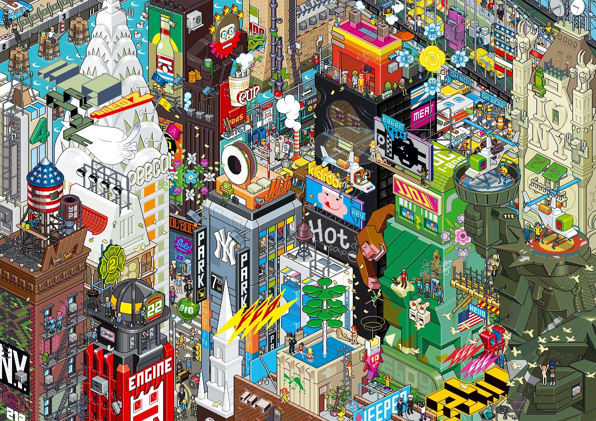
The fourth and final artist(s) I have decided to delve deeper and look further into is the world-famous digital collection eBoy. A group that have interested me for a long, long time and who, after further research, have made me gain a greater interest in precision, accuracy and extensive detail which are all main factors and elements of their unmistakable cityscape compositions.

One of eBoy's intricate compositions - so much to see!
In each of their compositions it can easily take at least fifteen minutes or more to really investigate the image and pick out everything that is included in it, including characters, signs, logos, building detail and accessories. Each piece is bulging with colour, interest and precision and are truly, in my opinion, masterpieces. I have trouble with patience at times and could never imaging myself setting myself such a mammoth task as eBoy set themselves.

Their surreal and 'fun' pieces really strike me as being literally something like I've never, ever seen before. I just think their work is fantastic even though it's something that I myself could never, ever do.

Image Source

Saturday, 23 March 2013

Alan Fletcher

The late, great Alan Fletcher is perhaps well-remembered as one of Britain's most recognised designers, especially thanks to his creations of now world-famous logos.

Fletcher's instantly recognisable logo for the Victoria & Albert
Museum, London. 
Having quite a childhood where he was moved around the world (from Kenya where he was born to England and then moved around there) Fletcher finally found his feet in 1949 when he began his art studies which eventually lead him on to study at the Central School of Art and the Royal College of Art where he studied alongside and befriended many now well-known designers including Ken Garland, Peter Blake and Len Deighton. In the 1950's Fletcher also accepted a scholarship to study at Yale University under prolific designers such like Paul Rand and Josef Albers at their School of Architecture and Design.

After his what seems like many years of studying and tutoring, Alan went on to design for brands including Pirelli, Cunard and Penguin Books with "Crosby/Fletcher/Forbes" alongside his collaborative partners Colin Forbes and Theo Forbes (who later went on to, along with the introduction of a few more designers, establish themselves as "Pentagram", a collective who I have discussed in a previous blog entry).

As well as his design work and having his work exhibited globally, Fletcher is also a well-established author who released multiple books under the theme of design.

Fletcher's work will remain as some of Britain's best in the design field, in my opinion.  His V&A logo for the London Museum is instantly recognisable and still as heavily used now in the field of British Art & Design as it was back when it was first designed and used over 20 years ago. A huge inspiration to me, Fletcher's simplistic yet bold style of working really has an effect on some of my work and I'm sure will do for other artists/designers for many, many years to come.

Image Source

Scott McCloud

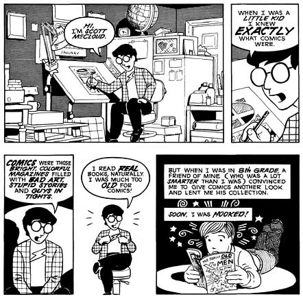
Cartoonist Scott McCLoud first came to my attention when I purchased his brilliant book "Understanding Comics: The Invisible Art" prior to starting my time at university. The very, very highly-illustrated book is set out itself as one big comic book,with all text written in speech/think bubbles or boxes, all in very precise points. A great read that helped me immensely in getting to grips with the way that comic books work properly and effectively but also it introduced me to a whole new form of "art" as comic book-style work had never been very prominent in my previous findings. The book opened my eyes for sure!

A good example of the way "Understanding Comics" is
set out (from start to end).
McCloud, hailing from Boston, Massachusetts, decided from an early age the career path that he wished to go down and found himself soon enough graduating from Syracuse University with a Bachelor in Fine Arts. From here he went on to establish himself as a professional designer with the creations of pieces such as "Zot!" (1984) and "Destroy!!" as well as being employed as a writer for the already well-established DC Comics name.

McCloud begins his work using basic pencil sketched and then completes/adds to them using digital software such as Illustrator for the typographic elements and Photoshop for the imagery.

Although publishing brilliant and widely-recognised work, Scott is nowadays perhaps most known for his work elaborating on the 'theory' of comic books with his published books, one being the aforementioned "Understanding Comics" (1994) but also his follow-on to this, "Reinventing Comics" (2000), which also took the extensive comic book layout as it's predecessor.

I'm very inspired by McCloud's work with it being, as I said previously, a big eye opener to the world of comic books and a really helpful and effective way of introducing me into a field of work which I had previously never really had an interest in.

Image Source

Thursday, 21 March 2013

Chris Ware

Chris Ware is a notable American comic book artist who is perhaps well know for his affiliation with the ACME Novelty Library cartoon company as well as his own series of graphic novels. Interestingly, Ware is not your typical cartoonist in the sense that his subject matter is quite dark and covers matters including mental health and negative elements within today's society.

An example of Ware's precise work, which
graced the cover of The New Yorker.
Resembling work that would have been popular and 'current' at the start of the 20th Century, Ware's designs comprise of meticulous detail (for both typography and general illustration) and influential components from the 'Rag Time era' such as classic cut out toy designs, music sheet designs and classic newspaper cartoonist-style illustrations.

All of Ware's precise and immaculately drafted work is done by hand with ink, although sometimes appearing to be at first glance digitally created. Using a range of geometric tools such as T-squares and rulers, Chris only uses digital elements into his work for the purpose of adding colour, nothing else whatsoever.

I'm a huge fan of Chris Ware's work, finding his attention to detail and meticulousness absolutely out of this world. The way in which he crafts an image or design is an art form in itself, with an unimaginable amount of time consuming geometric-based formatting involved. I myself can never see myself working in such a close-knit way due to being quite an "urgent" person, however I have total respect for artists and designers, like Ware, who do.


Saturday, 16 March 2013

Vaughan Oliver

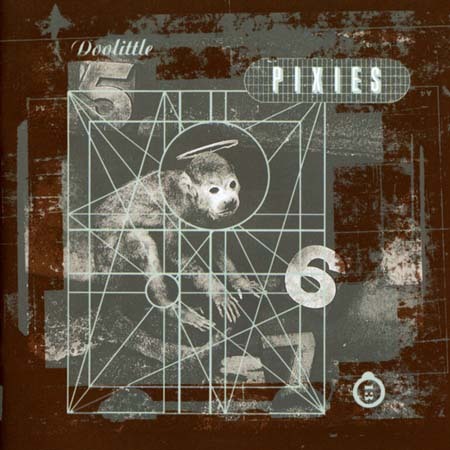
Vaughan Oliver is a British graphic designer from Surrey who is perhaps most known for his affiliations with both the design studios "v23" and "23 Envelope" as well as with record label 4AD who employed them in order for them to create distinct design identities for their signed musicians who ranged from The Breeders to Pixies, somewhat large names in the 1980s music scene.
Cover of Pixies' album "Doolittle", created by Oliver

Oliver is celebrated not just for his design innovation but also his collaborative projects, working with other designers such as Marc Atkins, Simon Larbalestier etc, and his brilliant imagination when it comes to projects. To many, Vaughan is credited as "setting the stage" for a graphic revolution which came about in the 1980's and 1990's and is often considered a master in the design and music industry post-punk era.

From viewing Vaughan's work it is apparent he is a very diverse designer who enjoys "pushing the envelope" so to speak. I find both his creativity and great imagination extremely appealing

Kyle Cooper

Being a graduate of the acclaimed Yale University and studying under a master of graphic design like Paul Rand, it would seem  that there would be a lot of expectation and "hype" to live up to. Kyle Cooper has definitely lived up to this.

Working in the field of motion picture title sequences, Cooper first reached critical acclaim whilst working in New York and created the title sequence for the 1995 "Seven" (often stylized as "Se7en"), a gritty crime drama starring Brad Pitt and Morgan Freeman.

Screen-grabs of the title sequence that Kyle Cooper created for "Se7en"
Cooper's use of hard-hitting imagery and loose, almost "scribble-like" font fulfilled his initial intentions of "pushing the bar creatively" and conveyed the main theme of the film, the Seven Deadly Sins.

Although not a fan nor an enthusiast of video-based design, I do appreciate the power that it has and how, like illustration, it can be used in many effective ways to convey an idea to a particular audience. I do feel that  Cooper's work for "Seven" really does set the scene of the film and I do like the gritty and tense atmosphere that this particular title sequence alludes.

Saturday, 16 February 2013

Saul Bass

Considered to be one of the greatest graphic designers of the 20th Century, Saul Bass is one of my favourite designers of all time. I originally came across his work when I first became a fan of Alfred Hitchcock's classic psychological horror movies and saw his poster for the classic "The Birds" (1963) which still remains one of my favourites.

Saul Bass poster for "The Birds" (1963)
The poster (shown right) struck me with it's drastic use of negative silhouette of the feather against the harsh and striking fire engine red background. I feel this is a brilliant way of understating the work of Hitchcock by not giving too much away in terms of what the film is about as Bass could have gone the classic route of showcasing everything the film had to offer on the poster. Bass' way adds mystery and "suspense", which I'm sure Alfred himself loved.

From researching more into Bass I have discovered that he has also done advertisement designs for another legendary director Martin Scorcese as well as being an extremely successful freelance graphic designer.

I'm really drawn to the silhouette style of Bass' work and feel that this technique really creates a very eye catching and impactive piece of design. I am a huge, huge fan.

Image Source

John Maeda

John Maeda is an American designer whose work focuses heavily on creating a connection between design, science, technology and literature (all fields in which Maeda is accomplished in). In terms of his artistic work, Maeda is sometimes credited as planting the seeds in creating creative motion graphics (which are used heavily today) by combining "classic" and traditional techniques of art and design with computer programming and technology.

To the left is an example of Maeda's work (Image Source), combining the use of typography and design to create this rather abstract image of a key (for a publication "Key" released in 2006). The typography used is a collection of street names and addresses, supposedly referencing and utilising the connection of a key
and "home"/where you call "home". Maeda is well recognised for this style of abstract and heavily computer/technology
based imagery which usually have a great emphasis on typography and symbolism.

Maeda's work is not something which I would usually stop and analyse as it's not a "style" which I would call myself a fan of. However, from doing so I have gained much understanding and  consideration for the work he does (and designers similar to him).

Image Source