Showing posts with label digital. Show all posts

Thursday, 9 May 2013

Elaboration 4: eBoy

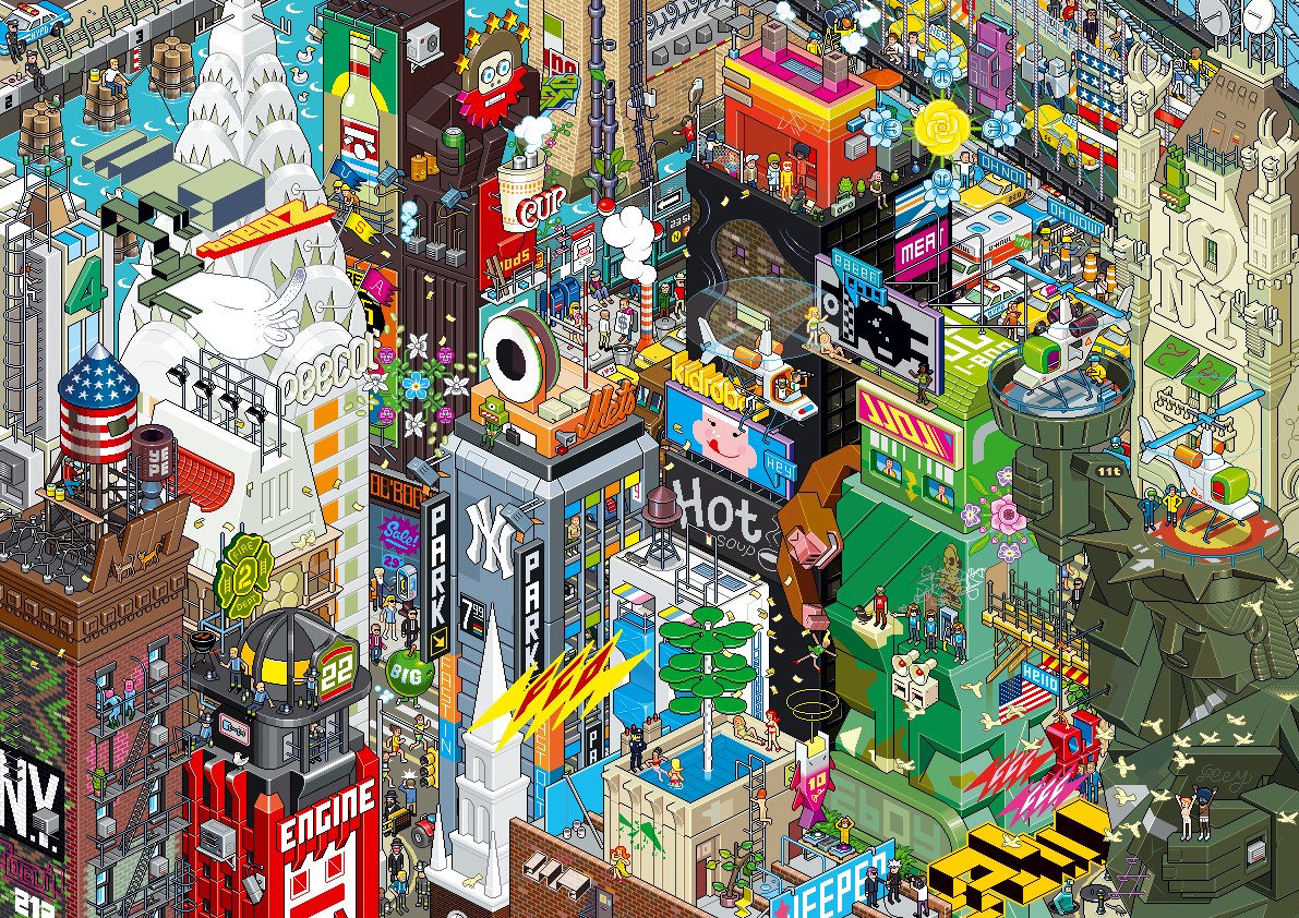
The fourth and final artist(s) I have decided to delve deeper and look further into is the world-famous digital collection eBoy. A group that have interested me for a long, long time and who, after further research, have made me gain a greater interest in precision, accuracy and extensive detail which are all main factors and elements of their unmistakable cityscape compositions.

One of eBoy's intricate compositions - so much to see!
In each of their compositions it can easily take at least fifteen minutes or more to really investigate the image and pick out everything that is included in it, including characters, signs, logos, building detail and accessories. Each piece is bulging with colour, interest and precision and are truly, in my opinion, masterpieces. I have trouble with patience at times and could never imaging myself setting myself such a mammoth task as eBoy set themselves.

Their surreal and 'fun' pieces really strike me as being literally something like I've never, ever seen before. I just think their work is fantastic even though it's something that I myself could never, ever do.

Image Source

Thursday, 21 March 2013

Jonathan Barnbrook

Again, heavily influenced by digital design and technology, Jonathan Barnbrook has made a name for himself around the world especially in Japan (where he is one of our most well-known designers) a country which Barnbrook has completed many designs for corporate identities.

A major factor and inspiration in Barnbrook's work is political issues and social factors. Barnbrook responds to these through his artwork, using it as a creative medium to get is thoughts and feelings across to his audience.

David Bowie - Heathen (2002).
A notable piece of work created by Barnbrook is the album cover for musician David Bowie's iconic album "Heathen". Barnbrook describes his creation as a descriptive play on the word "heathen", in which he famously turned the word upside down to emphasise the meaning (i.e. upside down cross symbols signifying the anti-religious and sometimes Satanic).

As a general rule, Barnbrook's work wouldn't usually interest me although I do like his use of "current affairs" in his work and also his fearlessness within his work (e.g. Bowie's album art could have and most probably would have terribly offended religious people).

Image Source

Wednesday, 20 March 2013

Susan Kare

Susan Kare is considered one of the innovators of computer design due to her creation of many of the digital interfaces during the 1980's for the Apple Macintosh and kept a close working relationship with Apple CEO Steve Jobs for many years to come.

Ph.D. Art graduate Kare, a native New Yorker, got a job with Apple through a friend from high school who worked for the company and recommended her to his colleagues. This is where Kare would really start to shine by designing typefaces, interfaces and her now trademark "cute" icons and logos with which she found a way to be very simplistic whilst still managing to keep said icons memorable.


A selection of Kare's classic Apple Macintosh logos.


Karen has since gone on to design for more well known companies including Facebook and has still kept her close ties with Apple by designing for their latest iPhones (the app "Karma Jar").

As her official biography states on her official site:

...good icons should be like road signs than illustrations, easily comprehensible, and not cluttered with extraneous detail. 

I adore Kare's icons and general style of work. The way she allows so much simplicity in her work is very brave and shows that she is a confident designer who has found her own signature and "what works well for her".

Image Sources: 1 2

Daniel Brown

Designer and programmer Daniel Brown has made a name for himself as a successful artist, working within the fields of Digital and Interactive Art (also Applied Arts and Design). Brown's technique is combining his previous extensive knowledge of computer programming and user experience design for items such as interactive phones/tablets (i.e. iPads/iPhones) as well as Flash players, Java Scripts etc with traditional design techniques to find a perfect balance and produce the creative work he does.

For well over a decade Daniel has been acclaimed by critics and has often found himself listed in 'Top 10' lists for categories such as internet designers and has had his work exhibited globally in New York, Tokyo and Milan for the British Council's "Great Brits" show.

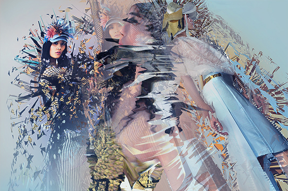
Researching Brown's work I found his floral pieces particularly interesting as well as his pieces which combined photography of already complex objects (such as fashion photography with dresses made out of 3D triangles of fabric cuts, for example) and then had them manipulated digitally to create an even more extensive effect/illusion.

An example of the manipulation of complex photography, almost making a pattern through digital warping.


Another element I found interesting was how his digital manipulations are not always totally obvious so the audience must "work" to get the full experience of the piece and not just have a quick glance. His work needs to be "studied" rather than just "observed".

Neville Brody

Once a student at the London College of Printing, British designer and art director Neville Brody is well known for his work in publications especially in the entertainment industry and primarily within music. Not only has he worked for high-profile magazines such as "Arena" and "The Face", Brody has also designed album covers for very successful musicians and bands, notable the legendary Depeche Mode.
One of Brody's eye-catching  typographical pieces
featuring Radiohead frontman Thom Yorke.

Aside from publication designs, Neville Brody is also well respected for his own work and has been known to attract considerable amounts of fans to his exhibition shows, most notably in 1988 where his work displayed at the Victoria & Albert Museum, London attracted over 40,000 viewers before embarking on an international tour off the back of this positive public reaction.

Another area of which Brody is established is typography as a founding member of the London organisation FontWorks before then going on to collaborate with legendary typographer Erik Spiekermann to create the FontFont library.

From looking at a range of Neville Brody's work it is clear that he is a designer who likes to push boundaries and I adore his use of bright colours and creation of shape and form through the use of type.

Saturday, 16 March 2013

Designers Republic

Various examples of work created by The Designers
Republic
The Designers Republic (often abbreviated to TBR) was a Sheffield-based Graphic Design studio which created pieces for various platforms in media and advertisement such as CD and DVD covers, music videos, web design and packaging. The group were universally renowned and recognised for their use of post-modernistic irony as well as minimalistic tendencies and uniformed style.

Founded as a flyer-designing company by designer Ian Anderson, the 'faction' later moved on to designing musical related pieces which would feature on album and single covers and go on to give them the exposure they desperately needed. Their work could be seen gracing the covers of releases from bands like Aphex Twin, Supergrass, Moloko and Pulp.

Aside from this area of design, TDR also worked in video gaming, creating the packaging and visuals for the 1995 Sega Saturn game "Wipeout" as well as the packaging and advertising campaign for the first of the "Grand Theft Auto" series (1997).

I really like how even though each piece is drastically different, you are still able to notice that it's possibly a piece created by TDR due to the minimalism and other defining factors that almost give their work a visual identity and connection.

Image Source

Saturday, 16 February 2013

eBoy

Known as "The Godfather's of Pixel", eBoy are a trio of designers who create very complex and interesting images for the purpose of advertising. Consisting of Kai Vermehr, Steffen Sauerteig and Svend Smital, the collective use influences from gaming organisations like Nintendo, toys and general pop culture to create their fascinating pieces. Their intricate cityscapes are mind blowing and incredibly detailed to the point where you could literally sit and stare at them for hours and keep discovering more and more new elements to the image.

Groove Armada - Soundboy Rock (2007)
I first came across eBoy when they designed the sleeve for a CD I own by the band Groove Armada. "Soundboy Rock. Show right (Image Source) the album cover, sleeve and every future released single from this album features eBoy's trademark intricate city design compiling of various situation, characters (some abnormal, for example as you can see underneath the "Soundboy Rock" sign there is a blue human-like mouse).

I absolutely love eBoy's work! The way that they can feature so many elements into an image simply yet effectively and how your eyes wander around the designs picking out different situations fascinates me. Coulourful, bright and interesting.

John Maeda

John Maeda is an American designer whose work focuses heavily on creating a connection between design, science, technology and literature (all fields in which Maeda is accomplished in). In terms of his artistic work, Maeda is sometimes credited as planting the seeds in creating creative motion graphics (which are used heavily today) by combining "classic" and traditional techniques of art and design with computer programming and technology.

To the left is an example of Maeda's work (Image Source), combining the use of typography and design to create this rather abstract image of a key (for a publication "Key" released in 2006). The typography used is a collection of street names and addresses, supposedly referencing and utilising the connection of a key
and "home"/where you call "home". Maeda is well recognised for this style of abstract and heavily computer/technology
based imagery which usually have a great emphasis on typography and symbolism.

Maeda's work is not something which I would usually stop and analyse as it's not a "style" which I would call myself a fan of. However, from doing so I have gained much understanding and  consideration for the work he does (and designers similar to him).

Image Source