Showing posts with label designer. Show all posts

Saturday, 23 March 2013

Alan Fletcher

The late, great Alan Fletcher is perhaps well-remembered as one of Britain's most recognised designers, especially thanks to his creations of now world-famous logos.

Fletcher's instantly recognisable logo for the Victoria & Albert
Museum, London. 
Having quite a childhood where he was moved around the world (from Kenya where he was born to England and then moved around there) Fletcher finally found his feet in 1949 when he began his art studies which eventually lead him on to study at the Central School of Art and the Royal College of Art where he studied alongside and befriended many now well-known designers including Ken Garland, Peter Blake and Len Deighton. In the 1950's Fletcher also accepted a scholarship to study at Yale University under prolific designers such like Paul Rand and Josef Albers at their School of Architecture and Design.

After his what seems like many years of studying and tutoring, Alan went on to design for brands including Pirelli, Cunard and Penguin Books with "Crosby/Fletcher/Forbes" alongside his collaborative partners Colin Forbes and Theo Forbes (who later went on to, along with the introduction of a few more designers, establish themselves as "Pentagram", a collective who I have discussed in a previous blog entry).

As well as his design work and having his work exhibited globally, Fletcher is also a well-established author who released multiple books under the theme of design.

Fletcher's work will remain as some of Britain's best in the design field, in my opinion.  His V&A logo for the London Museum is instantly recognisable and still as heavily used now in the field of British Art & Design as it was back when it was first designed and used over 20 years ago. A huge inspiration to me, Fletcher's simplistic yet bold style of working really has an effect on some of my work and I'm sure will do for other artists/designers for many, many years to come.

Image Source

Thursday, 21 March 2013

Chris Ware

Chris Ware is a notable American comic book artist who is perhaps well know for his affiliation with the ACME Novelty Library cartoon company as well as his own series of graphic novels. Interestingly, Ware is not your typical cartoonist in the sense that his subject matter is quite dark and covers matters including mental health and negative elements within today's society.

An example of Ware's precise work, which
graced the cover of The New Yorker.
Resembling work that would have been popular and 'current' at the start of the 20th Century, Ware's designs comprise of meticulous detail (for both typography and general illustration) and influential components from the 'Rag Time era' such as classic cut out toy designs, music sheet designs and classic newspaper cartoonist-style illustrations.

All of Ware's precise and immaculately drafted work is done by hand with ink, although sometimes appearing to be at first glance digitally created. Using a range of geometric tools such as T-squares and rulers, Chris only uses digital elements into his work for the purpose of adding colour, nothing else whatsoever.

I'm a huge fan of Chris Ware's work, finding his attention to detail and meticulousness absolutely out of this world. The way in which he crafts an image or design is an art form in itself, with an unimaginable amount of time consuming geometric-based formatting involved. I myself can never see myself working in such a close-knit way due to being quite an "urgent" person, however I have total respect for artists and designers, like Ware, who do.


April Greiman

Designer April Greiman, head of Made in Space (Los Angeles based design consultancy) is acclaimed for being a part of a collaboration who were given the honour of being named the "establishers" of the New Wave style of design that swept America during the 1970's and 1980's.

For over the last 30 years Gremain has proved to be an inspirational force in her specialist field of transmedia projects and film installation. Considered an artistic explorer, known to delve deep into themes of colour, text and imagery, April has found a good balance in incorporating the two seperate mediums of art and technology (including beautiful technology) into one.

"Hand Holding Bowl of Rice" - Koreatown, Los Angeles

An element that has played a big part of her career is public art installations, perhaps one of the most prominent being "Sears Great Indoors", a 60 feet long geometric concrete design with embedded accents of stainless steel. Also, "Hand Holding Bowl of Rice", an 82000 square feet design covering two walls which features an oil painted translation of a video still of literally a hand holding a bowl of rice. This piece was inspired by the tale of an Indian Goddess' gesture of rice as a sign of abundance as well as Gremain's own fascination with the fact that a single grain of rice has one of the most complex DNA's of any species.

Image Source

Jonathan Barnbrook

Again, heavily influenced by digital design and technology, Jonathan Barnbrook has made a name for himself around the world especially in Japan (where he is one of our most well-known designers) a country which Barnbrook has completed many designs for corporate identities.

A major factor and inspiration in Barnbrook's work is political issues and social factors. Barnbrook responds to these through his artwork, using it as a creative medium to get is thoughts and feelings across to his audience.

David Bowie - Heathen (2002).
A notable piece of work created by Barnbrook is the album cover for musician David Bowie's iconic album "Heathen". Barnbrook describes his creation as a descriptive play on the word "heathen", in which he famously turned the word upside down to emphasise the meaning (i.e. upside down cross symbols signifying the anti-religious and sometimes Satanic).

As a general rule, Barnbrook's work wouldn't usually interest me although I do like his use of "current affairs" in his work and also his fearlessness within his work (e.g. Bowie's album art could have and most probably would have terribly offended religious people).

Image Source

Wednesday, 20 March 2013

Yugo Nakamura

Yugo Nakamura is considered one of the world's greatest and most innovative web designers who has received acclaim for his unique and groundbreaking complex interface creations.

Back in 1999 Nakamura caused sensation when he unveiled an update to his MONOcrafts website (a site filled with over a decades worth of experimentation with web inteface and layouts which in their own right were deemed as "revolutionary") as it was the landmark event that kick started the use of the then newly-released Flash 4 computer software. The reveal saw his audience greeted with a totally new web experience with the aspect of the ability to create your own fluid interfaces.

An example of Nakamura's heavily digital
work.
Nakamura considers John Maeda to be a massive influence of his (who I have dedicated a previous blog post to) and it is easy to see some comparisons in their working style as both enjoy abstract and overtly creative digital aspect of design.

As much as I enjoy viewing work by designers like Nakamura and Maeda and appreciate their concepts and general design processes, I just could not see myself ever working in this way. I prefer images that rely on simplicity to get a message across rather than using a heavy influence on technology and manipulation.

Image Source

Susan Kare

Susan Kare is considered one of the innovators of computer design due to her creation of many of the digital interfaces during the 1980's for the Apple Macintosh and kept a close working relationship with Apple CEO Steve Jobs for many years to come.

Ph.D. Art graduate Kare, a native New Yorker, got a job with Apple through a friend from high school who worked for the company and recommended her to his colleagues. This is where Kare would really start to shine by designing typefaces, interfaces and her now trademark "cute" icons and logos with which she found a way to be very simplistic whilst still managing to keep said icons memorable.


A selection of Kare's classic Apple Macintosh logos.


Karen has since gone on to design for more well known companies including Facebook and has still kept her close ties with Apple by designing for their latest iPhones (the app "Karma Jar").

As her official biography states on her official site:

...good icons should be like road signs than illustrations, easily comprehensible, and not cluttered with extraneous detail. 

I adore Kare's icons and general style of work. The way she allows so much simplicity in her work is very brave and shows that she is a confident designer who has found her own signature and "what works well for her".

Image Sources: 1 2

Daniel Brown

Designer and programmer Daniel Brown has made a name for himself as a successful artist, working within the fields of Digital and Interactive Art (also Applied Arts and Design). Brown's technique is combining his previous extensive knowledge of computer programming and user experience design for items such as interactive phones/tablets (i.e. iPads/iPhones) as well as Flash players, Java Scripts etc with traditional design techniques to find a perfect balance and produce the creative work he does.

For well over a decade Daniel has been acclaimed by critics and has often found himself listed in 'Top 10' lists for categories such as internet designers and has had his work exhibited globally in New York, Tokyo and Milan for the British Council's "Great Brits" show.

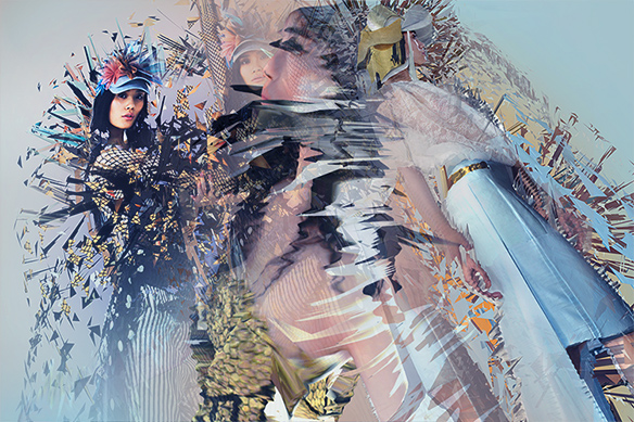
Researching Brown's work I found his floral pieces particularly interesting as well as his pieces which combined photography of already complex objects (such as fashion photography with dresses made out of 3D triangles of fabric cuts, for example) and then had them manipulated digitally to create an even more extensive effect/illusion.

An example of the manipulation of complex photography, almost making a pattern through digital warping.


Another element I found interesting was how his digital manipulations are not always totally obvious so the audience must "work" to get the full experience of the piece and not just have a quick glance. His work needs to be "studied" rather than just "observed".

Neville Brody

Once a student at the London College of Printing, British designer and art director Neville Brody is well known for his work in publications especially in the entertainment industry and primarily within music. Not only has he worked for high-profile magazines such as "Arena" and "The Face", Brody has also designed album covers for very successful musicians and bands, notable the legendary Depeche Mode.
One of Brody's eye-catching  typographical pieces
featuring Radiohead frontman Thom Yorke.

Aside from publication designs, Neville Brody is also well respected for his own work and has been known to attract considerable amounts of fans to his exhibition shows, most notably in 1988 where his work displayed at the Victoria & Albert Museum, London attracted over 40,000 viewers before embarking on an international tour off the back of this positive public reaction.

Another area of which Brody is established is typography as a founding member of the London organisation FontWorks before then going on to collaborate with legendary typographer Erik Spiekermann to create the FontFont library.

From looking at a range of Neville Brody's work it is clear that he is a designer who likes to push boundaries and I adore his use of bright colours and creation of shape and form through the use of type.

Saturday, 16 March 2013

Vaughan Oliver

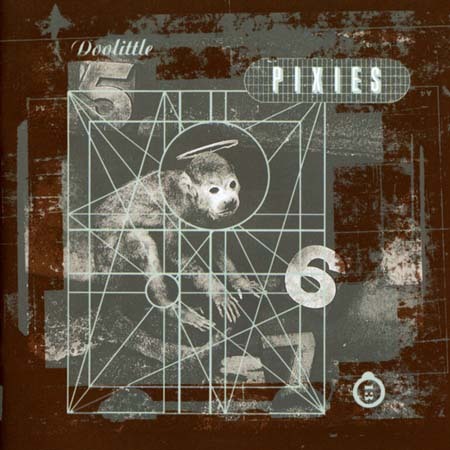
Vaughan Oliver is a British graphic designer from Surrey who is perhaps most known for his affiliations with both the design studios "v23" and "23 Envelope" as well as with record label 4AD who employed them in order for them to create distinct design identities for their signed musicians who ranged from The Breeders to Pixies, somewhat large names in the 1980s music scene.
Cover of Pixies' album "Doolittle", created by Oliver

Oliver is celebrated not just for his design innovation but also his collaborative projects, working with other designers such as Marc Atkins, Simon Larbalestier etc, and his brilliant imagination when it comes to projects. To many, Vaughan is credited as "setting the stage" for a graphic revolution which came about in the 1980's and 1990's and is often considered a master in the design and music industry post-punk era.

From viewing Vaughan's work it is apparent he is a very diverse designer who enjoys "pushing the envelope" so to speak. I find both his creativity and great imagination extremely appealing

Ian Pollock

"Tales of Terror" stamps (2007)
Ian Pollock is an award-winning British cartoonist and freelance illustrator and former student of the Royal College of Art (MA).

His first publication was "The Miracles of Christ" (1976) which started a lengthy career in design. He has illustrated advertisements and posters for organisations such as the Royal Shakespeare Company as well as having his work featured in renowned literary names such as Rolling Stone, Playboy, Elle, New Yorker, Esquire and Radio Times.

An interesting element to Pollock's career is his design of themed postage stamps. He has designed stamps on two separate occasions, once in 1990 where he created a commemorative Thomas Hardy stamp, a Tess of the D'Urbervilles stamp and a Mayor of Casterbridge stamp - which all were sadly dismissed by Her Majesty The Queen as "unsuitable" and later not published.

However seven years later Pollock was commissioned to design horror themed stamps in a series entitles "Tales of Terror" which showcased Mary Shelley's horror classic "Frankenstien" and also Bram Stoker's "Dracula" among others, which became extremely popular.

I'm drawn to Pollock's quick and confident style of drawing and his bold use of tone and shadow as well as his sparse use of line, I find his work very inspirational.

David Hughes

One of Hughes' many published illustrations,
this one depicting author William Shakespeare.
David Hughes is, I think, a brilliant yet somewhat unusual, perhaps "eccentric" illustrator. His work is somewhat "frightening" at times with his use of quite dark imagery (skulls, obscene nudity etc) but nevertheless always eye-catching and extremely interesting.

Stockport's own Hughes, who during his lengthy and successful career has worked both freelance and for major organisations (like Granada for example) received acclaim for his work for "Othello" which resulted in winning the D&AD Silver Award in 1999, has had his work exhibited at the Royal College of Art and has also won a Pentagram Award.

I just love Hughes' work. Although, as I said, at times it can be quite dark and "adult", I admire the way he uses rough tone in his pieces and am really drawn to the way he draws/describes his characters. For example, taking into account the Shakespeare piece in this post, it clearly is William Shakespeare yet it has not been drawn extremely well. David captures his subjects without the need for realism and time consuming attention to detail.

Image Source

Kyle Cooper

Being a graduate of the acclaimed Yale University and studying under a master of graphic design like Paul Rand, it would seem  that there would be a lot of expectation and "hype" to live up to. Kyle Cooper has definitely lived up to this.

Working in the field of motion picture title sequences, Cooper first reached critical acclaim whilst working in New York and created the title sequence for the 1995 "Seven" (often stylized as "Se7en"), a gritty crime drama starring Brad Pitt and Morgan Freeman.

Screen-grabs of the title sequence that Kyle Cooper created for "Se7en"
Cooper's use of hard-hitting imagery and loose, almost "scribble-like" font fulfilled his initial intentions of "pushing the bar creatively" and conveyed the main theme of the film, the Seven Deadly Sins.

Although not a fan nor an enthusiast of video-based design, I do appreciate the power that it has and how, like illustration, it can be used in many effective ways to convey an idea to a particular audience. I do feel that  Cooper's work for "Seven" really does set the scene of the film and I do like the gritty and tense atmosphere that this particular title sequence alludes.

David Carson

One of Carson's many publications on surfing.
Carson is a keen and well-known surfer himself.
American graphic designer David Carson is considered to be one of the innovative designers using typography (primarily during the 90's during the "grunge typography" movement) and is perhaps best known for his affiliation and work with Ray Gun magazine (where he cemented his unique style).

Producing works for clients from clothing brands Ray Ban and Nike to engineers Mercedes Benz and Toyota, Carson's somewhat unorthodox style and his incorporation of typography into this way of working is immediately recognizable on various advertisements, campaigns and in galleries alike.

Sort of a rebel in the typography field, one of the most notable moments in Carson's career was, whilst working for Ray Gun, using the completely symbolic Dingbats font (which is absolutely non-legible) for the write of an interview with musician Bryan Ferry of Roxy Music fame. His reason behind doing this? Because the interview was "boring".

Image Source

Ronald Searle

Award winning satirical cartoonist Ronal Searle CBE is one of my biggest inspirations. I read some of the books from the "St. Trinians" series as a youngster and was always (like with many other books) more interested in the illustrations than the actual story.

Cover of "The Terror of St Trinian's and Other Drawings" - a
publication  featuring a host of Searle's illustrations.
A diverse designer content-wise, Searle's other work includes his documentation of his years spent as a prisoner of war, with graphic representations of the conditions which he encountered (i.e. fellow soldiers dying from diseases like cholera etc)

Searle's confident, quick and loose style of drawing really opened up my eyes to the fact that illustration was not all about drawing something that looks "exactly" the way it would in reality and that it's okay to push the envelope.

Image Source

Saturday, 16 February 2013

Saul Bass

Considered to be one of the greatest graphic designers of the 20th Century, Saul Bass is one of my favourite designers of all time. I originally came across his work when I first became a fan of Alfred Hitchcock's classic psychological horror movies and saw his poster for the classic "The Birds" (1963) which still remains one of my favourites.

Saul Bass poster for "The Birds" (1963)
The poster (shown right) struck me with it's drastic use of negative silhouette of the feather against the harsh and striking fire engine red background. I feel this is a brilliant way of understating the work of Hitchcock by not giving too much away in terms of what the film is about as Bass could have gone the classic route of showcasing everything the film had to offer on the poster. Bass' way adds mystery and "suspense", which I'm sure Alfred himself loved.

From researching more into Bass I have discovered that he has also done advertisement designs for another legendary director Martin Scorcese as well as being an extremely successful freelance graphic designer.

I'm really drawn to the silhouette style of Bass' work and feel that this technique really creates a very eye catching and impactive piece of design. I am a huge, huge fan.

Image Source

John Maeda

John Maeda is an American designer whose work focuses heavily on creating a connection between design, science, technology and literature (all fields in which Maeda is accomplished in). In terms of his artistic work, Maeda is sometimes credited as planting the seeds in creating creative motion graphics (which are used heavily today) by combining "classic" and traditional techniques of art and design with computer programming and technology.

To the left is an example of Maeda's work (Image Source), combining the use of typography and design to create this rather abstract image of a key (for a publication "Key" released in 2006). The typography used is a collection of street names and addresses, supposedly referencing and utilising the connection of a key
and "home"/where you call "home". Maeda is well recognised for this style of abstract and heavily computer/technology
based imagery which usually have a great emphasis on typography and symbolism.

Maeda's work is not something which I would usually stop and analyse as it's not a "style" which I would call myself a fan of. However, from doing so I have gained much understanding and  consideration for the work he does (and designers similar to him).

Image Source