Saturday, 16 February 2013

Kathleen Hale

Kathleen Hale OBE was a British children's illustrator and author who rose to fame with her brilliant classic publication "Orlando the Marmalade Cat"

An example of the illustrations in Hale's children's book "Orlando the Marmalade Cat"
The stories of Orlando and his family have captivated children for years and follow the adventures and life in various situations including holidays and even his own Silver Wedding. Considered a classic of the 1940s and 50s the short stories are well known for their use of merging together the elements of adventure, excitement and fun whilst still keeping a heavy emphasis on the importance of one's family and friends throughout. These attributes have made Orlando and Kathleen herself a timeless classic and a big feature in nostalgic children's stories.

Having read an Orlando book when I was young, I remember it with great happiness and can thoroughly understand and agree with the comments made about it being timeless and a nostalgic classic. Clearly this view is universal as Orlando the Marmalade Cat is what eventually awarded Hale her OBE back in 1976.

A real classic.

Image Source

eBoy

Known as "The Godfather's of Pixel", eBoy are a trio of designers who create very complex and interesting images for the purpose of advertising. Consisting of Kai Vermehr, Steffen Sauerteig and Svend Smital, the collective use influences from gaming organisations like Nintendo, toys and general pop culture to create their fascinating pieces. Their intricate cityscapes are mind blowing and incredibly detailed to the point where you could literally sit and stare at them for hours and keep discovering more and more new elements to the image.

Groove Armada - Soundboy Rock (2007)
I first came across eBoy when they designed the sleeve for a CD I own by the band Groove Armada. "Soundboy Rock. Show right (Image Source) the album cover, sleeve and every future released single from this album features eBoy's trademark intricate city design compiling of various situation, characters (some abnormal, for example as you can see underneath the "Soundboy Rock" sign there is a blue human-like mouse).

I absolutely love eBoy's work! The way that they can feature so many elements into an image simply yet effectively and how your eyes wander around the designs picking out different situations fascinates me. Coulourful, bright and interesting.

Saul Bass

Considered to be one of the greatest graphic designers of the 20th Century, Saul Bass is one of my favourite designers of all time. I originally came across his work when I first became a fan of Alfred Hitchcock's classic psychological horror movies and saw his poster for the classic "The Birds" (1963) which still remains one of my favourites.

Saul Bass poster for "The Birds" (1963)
The poster (shown right) struck me with it's drastic use of negative silhouette of the feather against the harsh and striking fire engine red background. I feel this is a brilliant way of understating the work of Hitchcock by not giving too much away in terms of what the film is about as Bass could have gone the classic route of showcasing everything the film had to offer on the poster. Bass' way adds mystery and "suspense", which I'm sure Alfred himself loved.

From researching more into Bass I have discovered that he has also done advertisement designs for another legendary director Martin Scorcese as well as being an extremely successful freelance graphic designer.

I'm really drawn to the silhouette style of Bass' work and feel that this technique really creates a very eye catching and impactive piece of design. I am a huge, huge fan.

Image Source

Peter Saville

Peter Saville rose to prominence in the 1980's for his record sleeve designs for the company "Factory Records" where he created advertising for heavily successful artists/bands of the era including New Order, Joy Division, Roxy Music and Wham!.


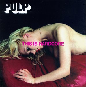
Above is a collection of some of Saville's world famous sleeves (Including Peter Gabriel, Pulp and Ultravox).


As a huge fan of music, especially music from the 1980's, I have come across Peter Saville's work many times. What I love most about Saville's work is that there is no particular "style" to it and that each album art is different, for example from the above images it is hard to believe that they are all created by the same designer (from the simple photography of one to the heavily designed and complex approach of another). There seems to be little consistency and correlation of any kind between each of his work which I find very interesting as it's almost like the "identity" is focused on the band for which he is designing rather than himself/his designs.

Images courtesy of Wikipedia.

John Maeda

John Maeda is an American designer whose work focuses heavily on creating a connection between design, science, technology and literature (all fields in which Maeda is accomplished in). In terms of his artistic work, Maeda is sometimes credited as planting the seeds in creating creative motion graphics (which are used heavily today) by combining "classic" and traditional techniques of art and design with computer programming and technology.

To the left is an example of Maeda's work (Image Source), combining the use of typography and design to create this rather abstract image of a key (for a publication "Key" released in 2006). The typography used is a collection of street names and addresses, supposedly referencing and utilising the connection of a key
and "home"/where you call "home". Maeda is well recognised for this style of abstract and heavily computer/technology
based imagery which usually have a great emphasis on typography and symbolism.

Maeda's work is not something which I would usually stop and analyse as it's not a "style" which I would call myself a fan of. However, from doing so I have gained much understanding and  consideration for the work he does (and designers similar to him).

Image Source

Shirley Hughes

Shirley Hughes is an award winning English author and Illustrator who over a 50 year career has sold over 11 million copies of her 50 published books whilst using her illustrative talents to design hundred more.

Above: An image from Hughes' award winning book "Dogger" (1977)

Liverpool-born Hughes has received wide recognition for her work to literacy and for her brilliant children's stories and collections, perhaps most notably of which being her series "Alfie" (which ran from 1981 to 2001). This collection tells stories of the eponymous character as he faces simple adventures in his everyday life (for example making friends, cheering up peers etc). A very innocent and light-hearted series of books which have captured the insterests of young children for over 30 years.

I'm a huge fan of the type of illustrations that Shirley creates, I admire the fact that the drawings are quite rough yet still managing to appear realistic with her use of colour and tone. One thing I discovered that really interested me was the original rough drawings from the Alfie collection (pre-publication):